


Energize or Calm? How to use color in your sensory room
3 min read
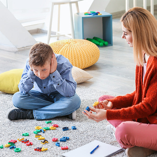
Starting a sensory room and not sure about color? It really depends on the intended purpose of your room. Color can be used to alert, energize, awaken, calm or regulate. Let's take a look at two basic sensory rooms and how you may choose to use color to your advantage!
A traditional multisensory room filled with fiber optic lights, bubble tubes, projected images and interactive panels, is typically a darkened environment using "white" light for the background. Sometimes these rooms even use UV lighting. By darkening the room, a more relaxed atmosphere can be created. In addition, "white" or the absence of light can also be used to create calm. In a professional sensory environment, the matting and walls are typically white to reflect images clearly against a wall. If you don't have white wall mats, you can use white wall paint.
An action-based sensory room can benefit from color. Using color can encourage movement and action! Let's look at colors and some of their properties: Back: The color black relates to the hidden, the secretive, and the unknown, and, as a result, it creates an air of mystery. It keeps things bottled up inside, hidden from the world. Teens tend to prefer black as it's a time when they are pulling away to find their own direction. Black can provide a great backdrop for your sensory room lighting. White: What black covers, white uncovers. The color white represents purity and innocence. White represents cleanliness, peacefulness, and calm. The meaning of white is also associated with peace, protection, and hope. White can be used to lighten your sensory room and encourage quiet. Blue: All shades of blue are soothing. It connects us to holistic thoughts. Blue mats are great for using on floors as they are easy to clean and encourage kids to come in and play. Blue matting is recommended as it's least likely to get dirty, but you can use colored paint to create a more active environment. You may also like to use a wipe-erase-based paint to provide space for signs as well as to write and draw. Any shade of light blue is the most calming. Green: Green is the master color. It is refreshing and cool. It connects us to nature and our environment. Green can also be playful and using green can be a great tool in your therapy clinic. Yellow: Yellow is warm. It reminds us of the sun. It connects to our mental self. Yellow brings energy into your clinic or classroom. Yellow is also easy to spot and a great color for kids who need visual orientation. Red: Red is hot. It can stimulate and excite. It connects to our physical self. Red toys are great for getting your kids to move. Choose red putty, red ride-on toys, or red balls to awaken your children. Purple: Purple is cool and calming to the nervous system. It connects us to our unconscious self. Purple also represents royalty. Since kings and queens don't move too quickly we think purple is a great color for seating equipment. Orange: Orange is warm and joyful. It connects to our emotional self. Orange reminds us of nutrition and can be a great scent to stimulate smell and taste. Connect with our team to start designing your sensory room today.
 Fiber Optic Flexible Lights
 Gel Floor Tiles
 UV Fiber Optic Sensory Lighting Kit
 SensaSoft™ Playhouse
 Crash Mat
 Therapy Balls
 Wobble Chair
 Soft Scooter Saddle
 AirLite Barrel Roll
 SensaSoft™ Squeezie Seat
Choose your colors based on emotional or personal preference or to control responses to an environment. Calming colors: black, white, purple, blue, green. Stimulating colors: brown, yellow, orange, and red. We'd love to hear which colors you choose! Please share your comments and suggestions with us in the comments, at customercare@funandfunction.com, or on our social media pages!


Leave a comment